

How to Know If Your Website Is Mobile Friendly
Most people visit your website from their phone, not a laptop. If your site doesn’t look or load right on mobile, you’re already losing traffic and credibility.
That’s why having a responsive website matters — it automatically adjusts to every screen size, giving users a better experience.
Good news: checking mobile-friendliness takes just a few minutes. You can do it online (Google’s free tools) or manually (right from your browser). Below are both methods, step by step.
Check Mobile-Friendliness Online
- Go to Google’s Mobile-Friendly Test — it’s free and official from Google.
- Run PageSpeed Insights for speed + mobile usability data.
- Enter your website URL and hit Analyze.
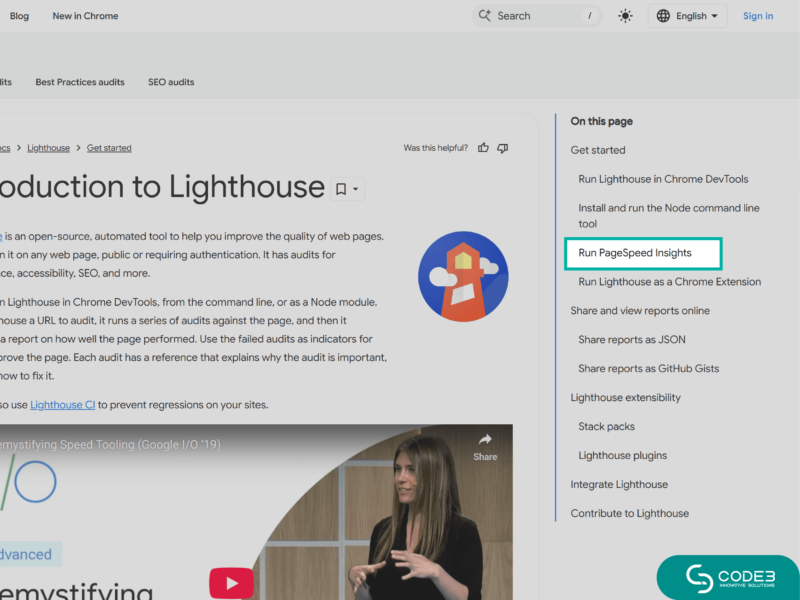
When Google analyzes your page, it inspects structure, responsiveness, and mobile layout.
- Green = your site passes.
- Red / Yellow = layout, text, or clickable elements need fixing.
What Google Tells You
- Mobile layout issues (small text, overlapping elements)
- Blocked resources or scripts
- Actionable suggestions to improve speed and usability
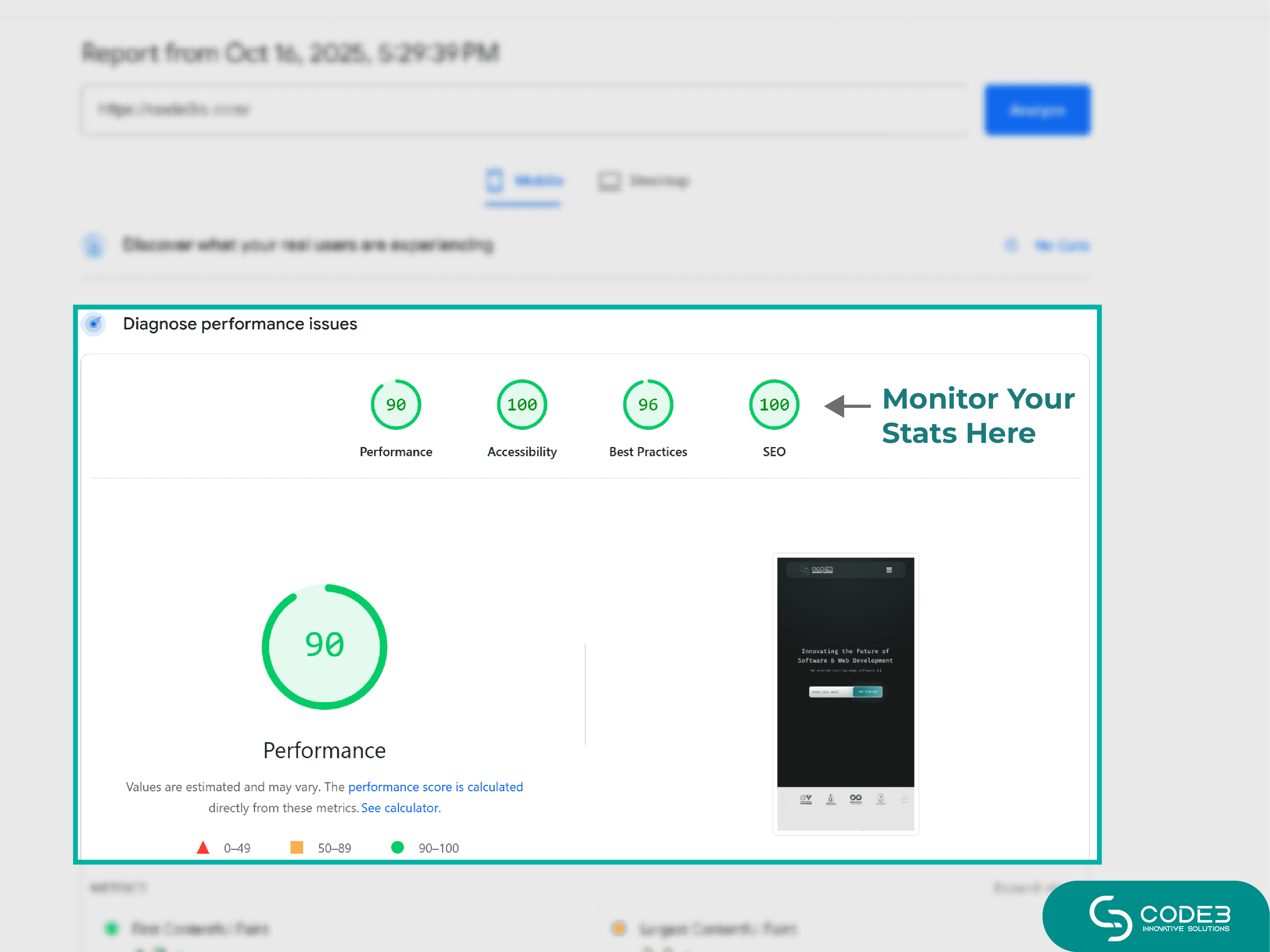
Benefits of Online Testing
- Quick, reliable data straight from Google
- Detects hidden issues tools or the eye may miss
- Instant, actionable suggestions
- Beginner-friendly — no coding required
Check Mobile-Friendliness Manually
Method 1: Use Chrome’s Inspect Tool
- Open your site in Google Chrome.
- Right-click and select Inspect.
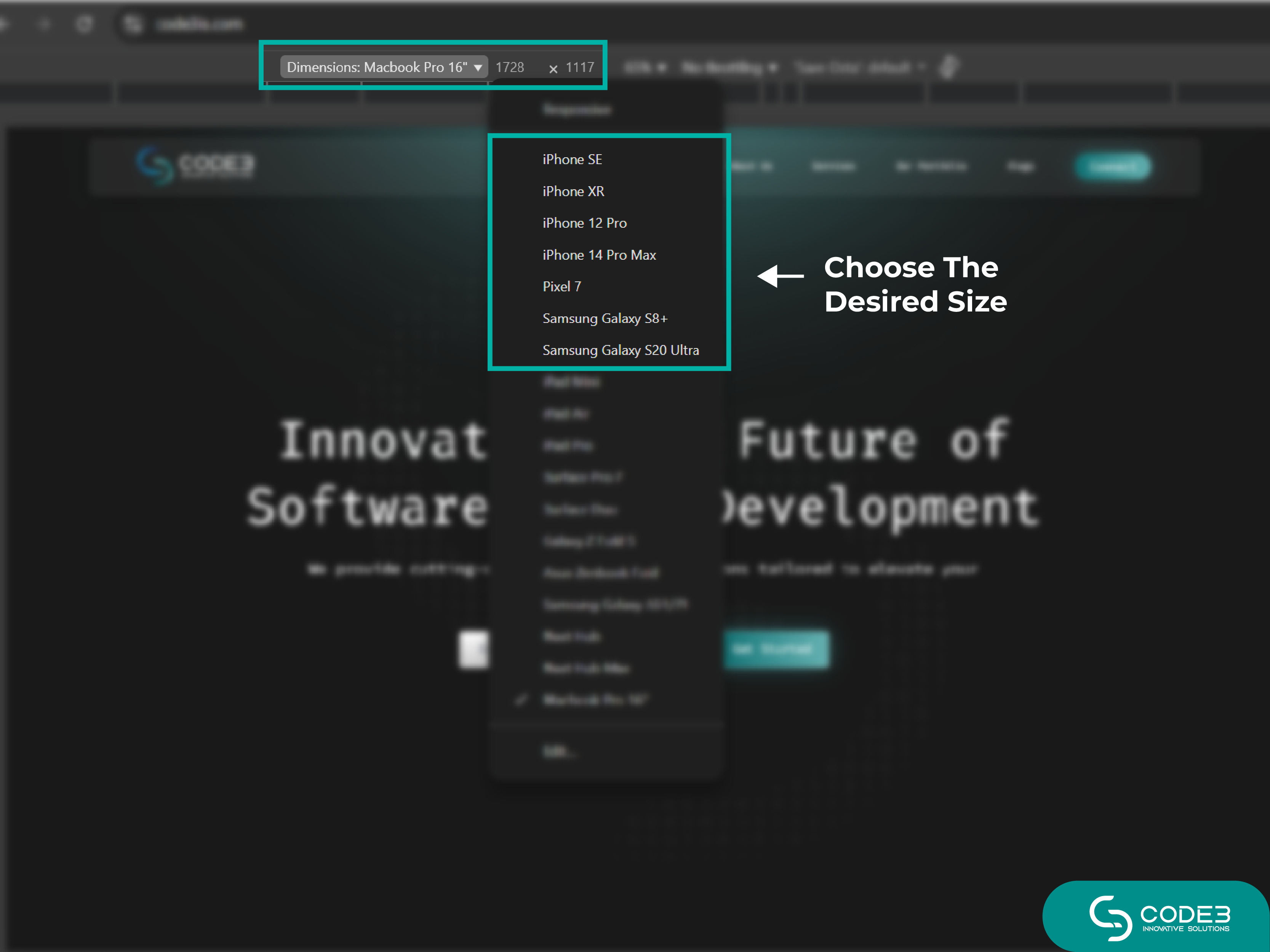
- Toggle the device toolbar (top-left icon).
- Choose a device type or enter a custom viewport size.
You’ll instantly see how your layout responds to different screen widths — helpful for spotting overflow, cramped text, or poor alignment.
Method 2: Test on Real Devices
Visit your site on several phones and tablets. Check:
- Readability of the text
- Spacing and tappable area of buttons
- Whether layout elements (menus, sliders, forms) adapt naturally
This helps you understand if your responsive website design actually works on real screens. Learn more about mobile-first design and other web development trends of 2025 here.
What to Do If Your Website Fails Either Test
If your site shows problems, here are quick fixes and next steps:
- Switch to a responsive theme or rebuild layout sections.
- Optimize image sizes and spacing.
- Best is to stay hassle free. Reach out to Code3is - we fix design, speed, and mobile usability all in one go. If your site isn’t responsive yet and you’re wondering how to make a mobile-friendly website, our team can help you build one from scratch.
Your one stop solution for branding, web development or digital marketing.
Get a Free Audit | See Our Portfolio